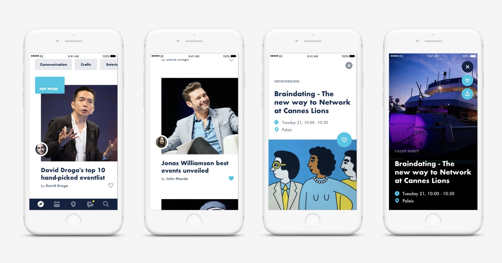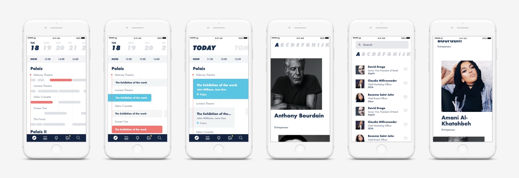
Event apps — Money20/20 and Cannes Lions
Redesigning the event apps for Money20/20 and Cannes Lions — one platform, two brands, five regions — with a "back to basics" focus on real networking over feature bloat.
Role
Design direction
Research
Design (UI — Money20/20 2018 US)
Overview
Ascential operates across information services and events, and as part of the product design team, I oversaw the end-to-end digital experience for two flagship event brands — Cannes Lions and Money20/20 — from event discovery and ticket purchase through to the in-event experience and post-event follow-up. The event app itself sits at the centre of that journey: helping attendees navigate the event and network with the people who matter to them.

The Challenge
The brief was to build one platform that could serve two very different audiences across five regions, without flattening either brand into something generic. That meant finding the shared foundation between Cannes Lions and Money20/20, while still leaving room for each brand's distinct identity to come through.
When I took over the Money20/20 US app in 2018, it had drifted into feature bloat — lots of functionality, none of it working particularly well. So we stripped it back. We defined the edition's goal simply as "back to basics," and put all our focus on the app's core proposition: business networking.
Vision
We wanted the app to help decision-makers bridge digital and real-world conversations — a tool for unlocking discovery, not just displaying information.
For networking, that meant real matchmaking rather than a glorified group chat: "I don't want WhatsApp, I want an intelligent matchmaking tool." For content, it meant retiring the printed schedule in favour of an app that could actually surface what attendees might otherwise miss.
Laying the Foundation
Before any UI work, we mapped the experience properly — customer journey mapping, a full meeting-maker flow and process, a notification matrix defining every message type across the app, and structured user testing on the meeting-maker feature itself. This gave us a clear, validated foundation to design against rather than guessing at what attendees needed.

Research, Built In
I led the research practice within the Events product team. Designers attend every event in person to run onsite research, focused primarily on app usability and the overall digital experience. After Money20/20 Asia 2018 — the first edition I attended — I produced an in-depth research report covering app performance and the wider event experience, which shaped the direction for later editions.

- Asia 2018
- US 2018
- Asia 2019
- Europe 2019
Evolution
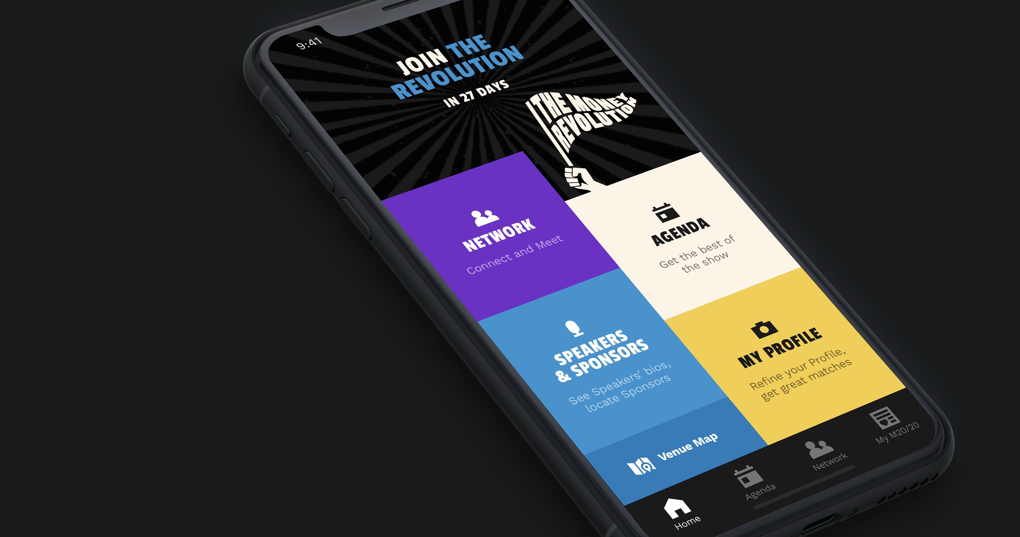
The app evolved visibly across four editions — Asia 2018, US 2018, Asia 2019, and Europe 2019 — each iteration sharpening the visual identity and refining the core networking and content features based on what we'd learned onsite.


Results — First Money20/20 app
- Live 4 weeks before the event
- 10,000+ downloads
- 10,000+ meetings facilitated
- 90% of meetings rated "very good"
- 60,000 messages exchanged between delegates during the event
- 40% increase in messages sent per user vs. the same event in 2017
- Best performing app to date