WGSN Data Visual Identity
In 2022, we set out to strengthen how WGSN's data capabilities were seen and understood. As a design team, this meant tackling something we hadn't done before: building a visual identity that could carry our data story on its own.
Role
Creative Direction
The Challenge
We needed a visual language that felt distinctly WGSN — one that balanced analytical rigour with creative thinking, without falling back on the data visualisation clichés common in our industry.
WGSN Data Anatomy
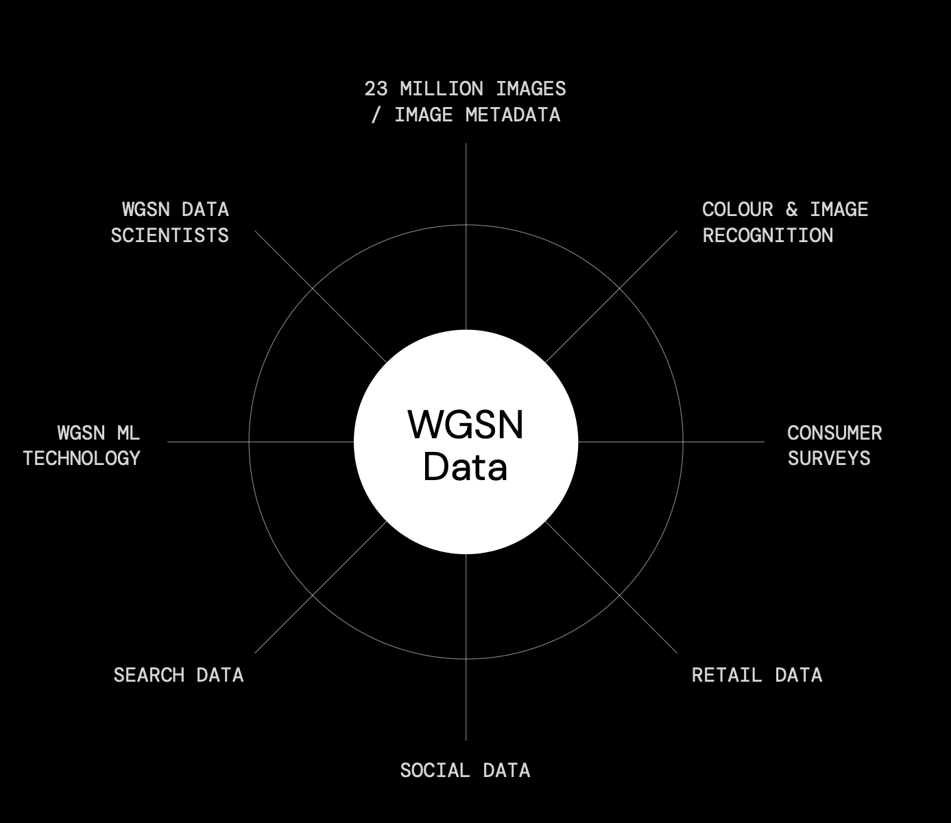
Laying the Foundation
We distilled our data story into three narratives: the adaptive nature of our forecasting, the human expertise behind it, and the complexity of our multidimensional models. Each became its own design direction. We chose the one built around human expertise — it had the strongest visual identity, felt most distinctive, and aligned best with the WGSN brand.
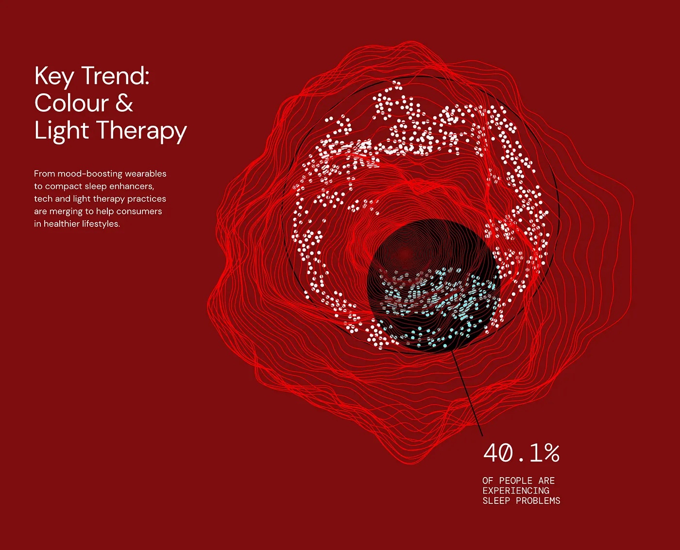
Crafting the Data Visual Identity
From there, we built a design toolkit: a flexible system of visual building blocks representing WGSN's core data capabilities. Designed to grow with us, the identity works less like a fixed style guide and more like a living system.
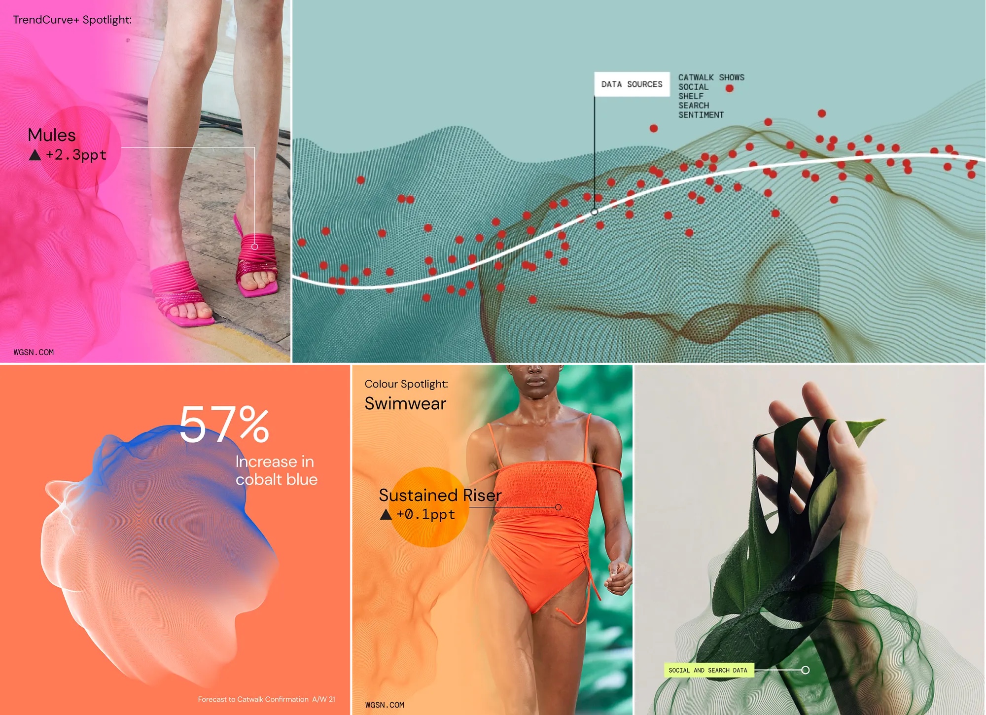
Impact and Results
The response was strong. The Data Visual Identity now runs across our major brand touchpoints — social, white papers, our public site, and the blog. Since launch:
- Social campaigns saw a ~500% increase in engagement
- Data-driven LinkedIn posts saw a 200% spike in engagement
- Average time spent reading data content doubled