The rest of this case study is password protected
It covers WGSN product work that isn't public. Enter the password to read on, or get in touch and I'll share it.
The Challenge
Two problems: a disjointed experience, and content that published in stages rather than all at once. Users landing on the live feed had no clear next step. And because images arrive in waves after a show — first pass, then detail, then fully finished — what felt like process to us read as inconsistency to users.

Listening to Users
We pulled feedback from support logs, an NPS review, and a survey run directly on the gallery. The themes were consistent:
- Want more detail shots — not just the hero look
- Frustration with how long content takes to appear
- Difficulty finding specific items or shows
- Too much jumping between places to go from a report to its images
- Simpler ways to save and download
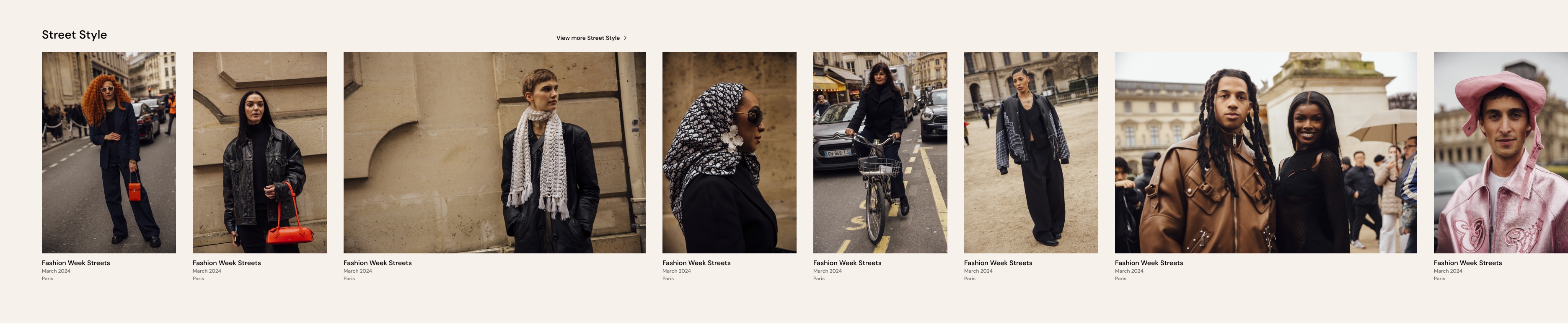
- A wish for more context alongside the photo, not just the photo
The searchable gallery was clearly the heart of the experience — designers were its most engaged users.


Design Vision
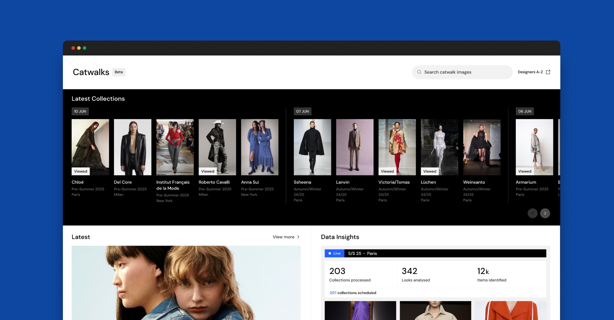
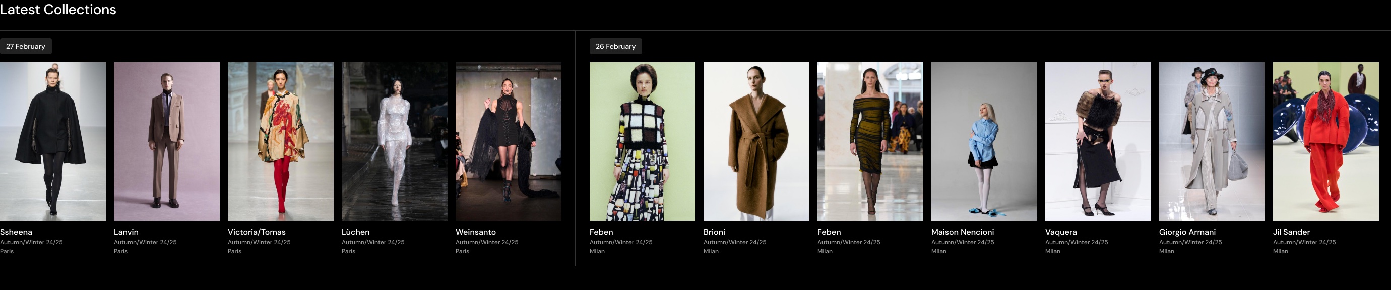
One central hub for all-encompassing catwalk content — brought forward into the main navigation as its own destination, rather than buried under something else.

Design Considerations
Elevate data. Layer WGSN's trend intelligence directly over catwalk imagery, so it reads as insight, not just a photo archive.
Keep what works. The core browsing pattern was already well-loved. Build around it, not over it.
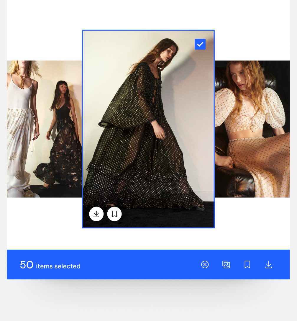
Multi-select & save images
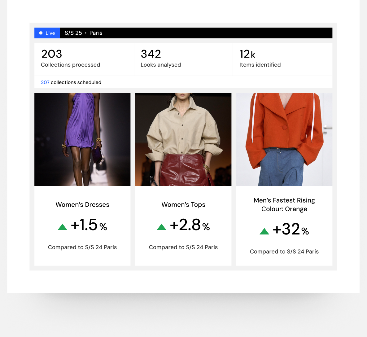
Live data insights

Latest collection
Outcome
Consolidating eight fragmented catwalk journeys into one destination made it the most engaged section on the platform — 37.6 return visits and 35+ minutes per user, ahead of every other major destination.